by Matthew Russell - Posted 5 years ago

My Fellow Vigilantes, we have gathered together today to discuss and come to a unified understanding…What constitutes a good layout? In our first post, we will discuss the Rule of 3.
For anyone who doesn’t know, check out our downloads page to get a good start.
When I’m writing I have a blank page open and printed out that I can use as a thumbnail sketch. This helps me with everything from pacing to general layout.
Let’s assume that I am given a script to draw. Example below: (This is from one of the comics I wrote called Champion)

PAGE 2
PANEL 1: Champion is standing up with several guys (in prison jumpsuits) unconscious at her feet. One has a purple mohawk, one has blond hair, and the other is bald. They all have metallic colors on. Other costumed heroes are standing behind her. They are all new and should resemble old outdated comic costumes of the 50’s and 60s. Champion looks very angry. This shot is slightly looking up at her giving her a strong pose. She is looking off in the distance.
CHAMPION
Get ready. It’s gonna get nasty!
CHAMPION
On my mark, we charge.
PANEL 2: This is a picture of the heroes charging. There are bullets, energy blasts and all sorts of other projectiles coming at them. They are all facing right while charging in an orchestrated pattern. There is no cultural diversity among any of them, they are all white males. Hair color and costume design may change. Champion is front and center leading the charge.
CHAMPION
NOW!!!
PANEL 3: I want this shot to be a mirror image of the last panel. This time it is the inmates that are charging to the left. They have the same kind of projectiles flying at them. They are wearing variations of the prison jumpsuits (some have the bottoms only with a tank top, others are bare chested). They all have the metallic colors. Racial diversity amongst the
ONE OF THE BAD GUYS
KILL ‘EM ALL!!!
I know that there are some things already that people are like …WHAT!?! There is a line about the good guys with no cultural diversity among them. Well, that is a story for another time. This is about the layout.
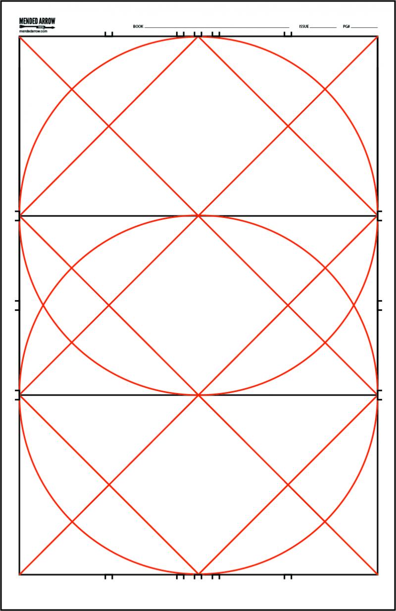
Notice that I have everything into 3 panels. For this exercise I am dividing the page into 3 sections. I could divide the page into 3 equal sections horizontally or vertically.
What is the Rule of 3?. Well, basically everything is visually more appealing in by dividing everything into 3. This isn’t just visually. When writing, things with the most power are said in 3. “Ready, Aim, Fire.” “Lights, Camera, Action!” “Blood, Sweat, & Tears!”
Artist like to place major themes or subjects on the intersecting between 3rd lines. Now, with comics, we can place everything in boxes (or panels) that take up a third of the page. I want to break the mold a little and am messing with the rule of 3. I am choosing the horizontal layout.
The first should be about top 5/8ths of the page. After that, divide the other 2 pages in half. This will give me A big panel at the top and 2 equal panels at the bottom. All 3 are horizontal.
Now, the first panel will have our hero will be front and center. Our hero shot, pardon the pun. The next 2 panels mirror each other with the good guys and bad guys charging in.
Even though they are stacked above each other, you know that this is more of a side by side feel and that they are about to collide. In actuality, they could both be running from each other, but we all know what’s really happening here.
Besides the fact that I wrote it? How dare you for even thinking otherwise. I’m offended. J/K
Now, the rule of 3 dictates that this would be good because it is divided up into 3 panels. In the middle of the 1st one is our hero shot. Bottom 2 are divided equally. In theory, layout is easy to read and understand. As long as the art work, so should the layout.