by Matthew Russell - Posted 6 years ago

To my flock of Vigilantes, welcome to another post by the illustrious me. Wow, that was a little heavy handed but still, I stand by my words.
The rule of 3 is a very common rule, extending far beyond the drawing board. It is simple, it is elegant. Think trinity; Holy Trinity (both DC Comics 7 the Bille), 3 act plays, phases of matter (solid, liquid, gas, yep, laying science on ya), and even government (Life, Liberty, & the pursuit of happiness, Community, State, Country, or Democrat, Republican, and Independent).
Today we are going to be discussing the Rule of Thirds, or the Rule of 3 and how it applies to drawing and design. This is widely considered the most used “Composition Rule” partly due to the fact that it is the easiest to explain and follow.
This is rule is all about the placement of the subjects in any given piece of art. Divide any drawing into thirds vertically and horizontally. The intersecting lines are the focal points.
As you can see from the above diagram, the placement is pretty simple. This is where you naturally look so this is where you place the focal content.
When drawing or framing a photo, try to line up your main focal points with the grid above. You want to get that money shot on or near the dividing lines. Don’t worry if it is a little off. Nothing in nature is perfect.

When looking at generalized landscapes (see below image), you don’t necessarily want the horizon line directly halfway through the image. This will make the image “feel cut in half” and divide the viewer's attention.

The problem with that is that the amount of detail takes a drastic turn halfway through the image making the viewer draw unwanted and often subconscious comparisons between the 2 halves.
To correct this problem, use the bottom third horizontal line as a base for your horizon line. This way the general amount of detail above and below the line will even out.
Sometimes you will want the image centered. This is fine. Try to keep the rule of thirds in mind as you do this. This means placing the bulk of your image between the middle thirds of your image.

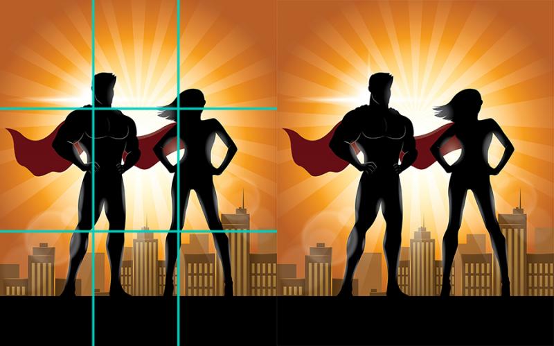
Now, granted, this is not a current cover of any comic. This is a basic design used to showcase a male and female superhero. They have capes and everything.

As you can see both heroes line up slightly on the vertical lines. At the intercepting points are the head and knees.
The skyline sits on the bottom horizontal line, keeping the busy section on the bottom third. The background starburst centers just below the top horizontal third and keeps the main glow in the center third.
With all the complicated pieces kept to the intercepting points, this allows you room to add a title, any info such as issue number or publisher info. It also gives you room to add any bar code or wording to help sell the comic.