
by Matthew Russell - Posted 6 years ago
Top of the morning to my Vigilante Nation out there in the world of comics.
Wow, that was a mouthful. Horrible intro. This brings me to the topic of today. Most people know that the cover to a comic is your introduction to the story. Major comic companies will bring in a special artist to just do the cover in order to make it shine, or pop.
This could often boost sales, but in some cases, (specifically these) force the comic to fall flat on its face. Sometimes it the artist doing a horrible job, sometimes a great cover just doesn’t stand the test of time and the evolution of language.
Here are some crazy, zany examples of covers gone wrong for whatever reason.
This one is just boring. Let’s face it, in the midst of action and adventure, storytelling at it’s finest, this cover helps you lose interest faster than a one-legged man in a butt-kicking competition.

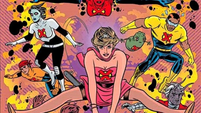
This cover is actually a photograph but you can’t deny the sexual innuendo here. I truly don’t know what else to say other than...wow.

This is a strange one. It looks like Groot spanking Wolfgang "Woozy" Winks (Plastic Man’s sidekick). Reading it online it is a sentient tree beating Green Lantern's sidekick Doiby Dickles. There is just so much wrong with this. Also, why was that era so into spanking on their comics!?! It makes you wonder about the artist.

For the most part, the faces are beautifully painted, but let’s take a look at the ultimate jacked-up Thor. First off, proportion-wise, what the hell!?! His costume looks like it is spray painted onto a bodybuilder. This just isn’t right.

Um, creepy. That’s it, just creepy.

I’m truly not sure what happened to Wolverine here. It looks like Logan had a baby with Nosferatu and threw some Gary Busy in for good measure. Although the interior art is great, the cover suffered a defeat.

Not much is remembered about the art or the writing. If that doesn’t say a lot, I don’t know what will. The major problem is that this holographic cover damn near sends you into an epileptic caesar. (Just a joke for those suffering from Epilepsy). Anyway, this cover was so ugly, it would make a freight train take a dirt road. (I have no idea what that actually means, I just heard someone say it while I was in Arkansas).

This one wasn’t as bad as you would think. Frank Miller’s art is beautiful. The problem came when the letterer got ahold of it and misspelled Elektra. Yep, right there on the cover, they got her name wrong. Bravo...just Bravo. Spell check.

Back then, this wasn’t considered a racist thing. Sometimes I wonder how did our grandparents survive? This did not age well. On behalf of comic fans everywhere, we apologize, Japan. This should not have happened, especially not from our beloved Superman.

If you were getting commissioned to draw the cover to a comic based on a movie, the first thing I would do would be to watch the movie. That was obviously not the case here. Chewie looks more like a Sasquatch from Alpha Flight, R2 looks strangely buff, and who is that guy flying the Falcon? It sure isn’t Han or Lea. Han almost looks like he has a double chin.

For more crazy covers, I want to leave you with this video. Just wait until you get to Hansi. This will blow your mind.
If you want some more laughs, check out the Marketplace. There is a gem in there called “How NOT to Draw Manga”. Even if your not a comic creator, this one is chock full of humor and some pretty embarrassing practices that I, myself, have been guilty of.

