
by Matthew Russell - Posted 4 years ago
Welcome, my CryptoComic Compatriots! Holy crap, we are on part 5 of this 9 part series. Its seems like forever ago that I began this series. I have to say, by really working on this, my own personal art has improved drastically.
Today we are going to teach you the basics of color and light. Yep, today we are going to learn about science.
What is color? How does it work? Why do we talk about color and light in the same context? Well, color is just reflected light. Depending on the wavelength of the light reflected off of something, this gives us color. Let’s talk about how color works together before we start talking about how light works. It’s generally easier that way.
When you say something like color theory, there is really far too much to it. We have to learn how colors relate to each other. In order to learn that, let’s take a look at the first thing we need to know; the Color Wheel.
We are basically going to only be focusing on RGB (Red Green Blue) which is the main color used on computer screens. This is additive color as opposed to CMYK (Cyan, Magenta, Yellow, & Key [not Black] ).
Just a quick recap, we talked about the different types of color, way back in April of 2019 with a post called Size, dimensions, colors, and styles. What does it all mean?. Click the link and go check it out.
Strange fact: Sr. Isaac Newton was the first to really develop the traditional color wheel back in 1704.

There are some basic concepts with the color wheel that we have to understand to truly move on.
They cannot be created by mixing any other color. They are the cornerstone of RGB.
These colors are: Red, Green, and Blue.

When you mix the 3 colors in equal parts, you get these fantastic colors. They are the half way point between the Primary Colors.
These colors are: Turquoise , Orange and purple

By mixing the Primary and Secondary colors in equal parts, we end up with the Tertiary colors. Their hue is a two color name, see below.
These colors are: Yellow-orange, red-orange, red-purple, blue-purple, blue-green & yellow-green.
Like with music, poetry, and Thanos’ plan in Infinity War, there is balance and harmony in all things. How do we achieve this in color? What does it look like when colors exist in harmony? What colors go together?
Now we move onto the next phase where we explain everything.
When colors contradict each other (not go together), your brain will automatically reject the idea and your viewers will instinctively find the piece of art, well, ugly. It is for this reason, that we combine certain colors in order to create a pleasing pallet. This is why gold and blue pair so well with each other throughout history.
Analog colors are those that are side by side on the color wheel. I tend to use these when I am coloring a picture with the center color being the base. The darker color, I use for smaller shadow, and the lighter, for the highlights. This will give me a starting point before I add things such as darker tones, reflected light, and so on.
This is my starting cell shading (coloring). Once again this is just to start out. I will eventually add more colors to the piece.

These are colors that are directly opposite on the color wheel. They complement each other so perfectly. Pick a color that you want to use as the main color and in order to give it some accents (smaller embellishments), pick the opposite color. They will go together like cheese and wine.

Now let’s move on to lighting.
There are 2 main rules of lighting, #1 Where there is a change of shape, there is a change of value. #2 There are no hard edges in reality, but there are in comics.
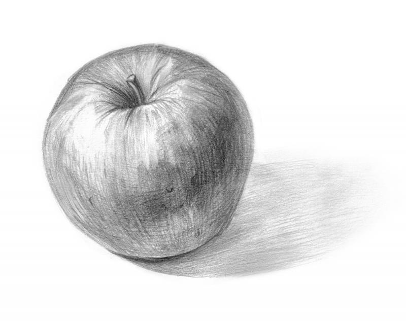
Let’s start by analyzing a simple ball. We have drawn this a million times in various art classes, but let’s really take a look at it.

This was drawn with Procreate, but that doesn’t mean that it isn’t easily recreated on paper. There are 5 main parts of this drawing.
- Full Light
- Half Tone
- Main Shadow
- Reflected Light
- Cast Shadow
Lets start by making a circle. This will be our ball that we are shading. It will be sitting on a table top so give is a horizon line in the background.
If you remember our post about perspective, figure out a point off in the distance and consider that your light source. Sometimes I make a dot, other times I make a small quick drawing of a lamp. Keep it simple and pick a spot.
The most direct (closest) point to that spot will be the full light section. This will be virtually white.
We move in an outward circle from our “full light” section and gradually shade darker, the further we get from that brightest point. This is where we get the rule of “Where there is a change in shape, there is a change in value.
Because the ball is round, it is always changing shape, meaning that the light is bouncing off in several different directions at the same time. This gives us a gradual change.
This is the section that is the darkest section on the ball. This is where the least amount of light is hitting the ball.
Underneath the ball it strangely gets lighter. This is because light reflects off the table and hits the ball. This is lighter than the Main Shadow but slightly darker than the halftone from earlier.
Without this reflected light, the casual viewer might not know what is missing, but it will not look 3 dimensional to them. Basically, the novice won’t know what’s wrong, other than there is something off.
From the light source, draw a straight line to the outside of the ball on both sides. Follow through for a while. You will make an oval where the light creates what is known as the cast shadow. This is the shadow created by the object.
This is always the opposite of the light source. It is the blocked light from the light source.
Keep in mind that this is generally not a hard line. It fades out to the color or shade of the ground plane. Even if this gradient is small, it fades.
Now in comics, there is generally a hard line. This is because with inking, unlike with a pencil, you cannot get a gradient. Instead, we use hatching or cross-hatching.
We also generally give the main focus an hard outside edge. This is done with line weight. For more information on this, check out our blog post on line weight: All About Line Weight Part 1 and All About Line Weight Part 2.
I found this great video on the simple shading aspect for comics. Robert Marzullo sticks with a simple leg.
I especially love when he talks about the textures of the material covering the leg. The first leg looks like the work of Tom Grummett and Dough Hazelwood. I love it.
I remember a joke from years ago “How do you get to Carnegie Hall? Practise, practise, practise.” It's so true.
How do you apply this, practice, practice, practice. Create some basic shapes with perspective tools, and then shade them. When you master that, draw your characters using basic shapes, and shade them as the basic shapes.
Come on back for our next installment when we tackle “Composition”. Keep drawing. See ya soon.


