
by Matthew Russell - Posted 5 years ago
Welcome my CryptoComics Compatriots. We are back with another tutorial, this time on inking. This is a delicate process but much needed. Don’t sweat it, Uncle Matt is here to help calm your nerves and teach you whatever you need to know.
We have talked before about the need for line weight and techniques so we aren’t going into that as much this time. Today we are talking about getting your paper (and you) ready.
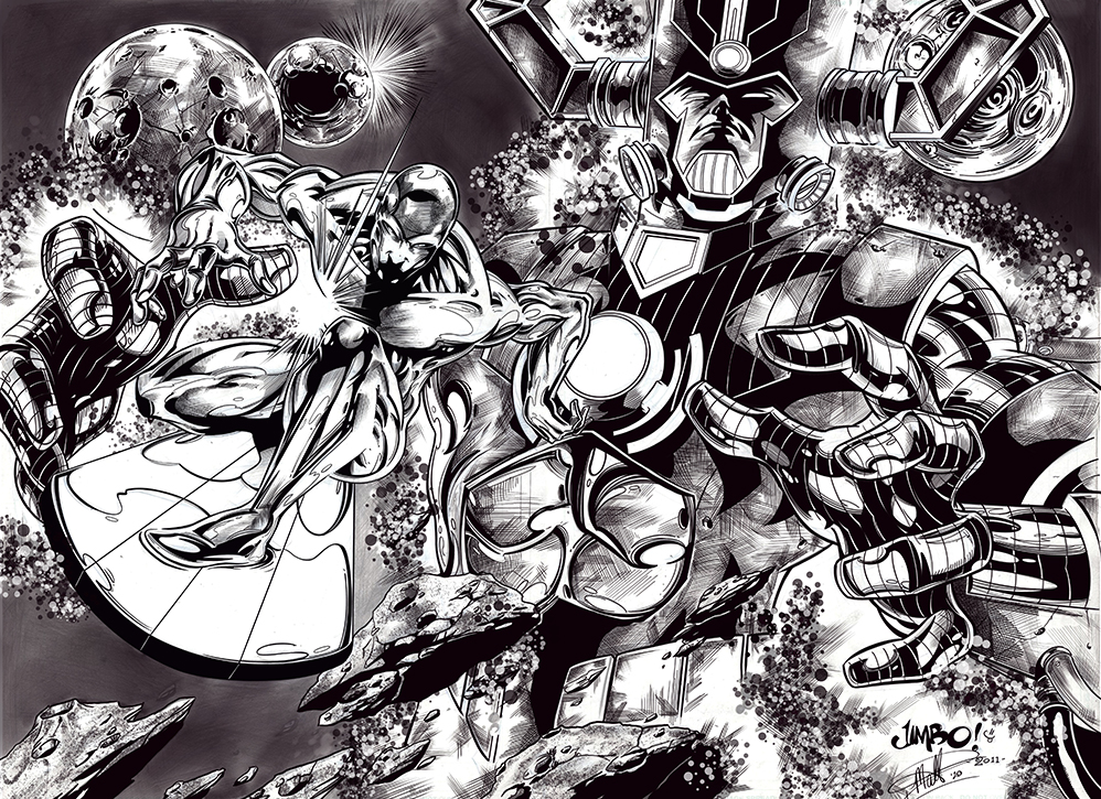
The image above is penciled by Jimbo Salgado and inked by myself.
Way back in the Golden Age of comics (1930s through the 1940s), printers, and pencil drawings didn’t mix that well. The pencil rarely showed up. As a result, we would go back over the penciled drawings with a variety of pens in order to make the lines show up.
This made it so shading was no longer possible using the old pencil techniques. Hatching (or cross-hatching) was born of that need.
This is a technique used by anyone whose medium does not allow blending; engravers, draftsmen, and most importantly inkers. It gives the illusion of shading by filling a section in appropriate areas with smaller parallel lines. By varying the intensity, proximity, direction, and weight of the lines, we give the approximation of shadow.
More about this later.
Be careful when trying to ink. Many believe that erasing is a non-starter. Don’t be discouraged, it is somewhat possible.
Let’s start with the most simple one; white-out. Apply white-out to any given (hopefully small) area that needs correcting. Fully let it dry before you begin again.
If this doesn’t work, we might need to move onto another chemical.
Place a piece of tissue paper under your drawing. Take a small amount of nail polish remover and place it onto a cotton swab or makeup pad and gently rub away the ink.
This will also remove the pencil marks so be careful. Gently dab and swipe to remove the ink. Don’t go overboard as this will eat its way through the paper. If you need to, let it dry again before continuing.
Follow this up with a hot iron to smooth out the paper and return it to its original shape without warping.
This method only works if the ink has not bled all the way through your paper.
This is potentially VERY destructive so use this one cautiously. Take a piece of sandpaper with a higher CAMI (the system for rating sandpaper was created by the Coated Abrasives Manufactures’ Institute) number. My recommendation is a minimum of 220 grit sandpaper.
Gently (and I mean gently) rub it onto the ink that you are trying to remove. DO NOT PRESS VERY HARD!!! This will be removing the paper along with the ink. Just be clear that this will also change the texture of your paper when you are redrawing.
For more tips check out this video below. It does repeat my first suggestion but it also has some other cool ideas.
My first suggestion is to wash and dry your hands completely. Oils from your hands can damage the paper and ruin your day.
Having a spare piece of paper to rest your hand on while you are inking will also greatly reduce the amount of smudging any lines.
There is also time. Give a section of your work ample time to dry before going back over it. Smearing will give you the worst case of the “still-wet-lines”. Avoid this at all costs. The easiest way to do this is just time.
Place your paper on a drying rack in a warm dry climate. Gently touch it when it looks dry. In most cases, the ink will lose its shine.
The best way to avoid inking mistakes is simply using the correct tools.
Just like every other art medium, there is no definitive way to ink and there are a plethora of tools to use. You have to decide what will work best with your style of comic and what you feel the most comfortable with.
Many people don’t realize that you can use markers to ink, just as easily as you can to color. I have a set of Copic alcohol markers that I completed a cover with. I love the way it turned out.

For more traditionalists, a marker is simply used to outline the pencils. A good felt tip marker works great for that. A nice clean thin-tipped marker will give your nice smooth lines. Thicker markers are great for filling in wide areas.
These areas are usually indicated with a bunch of Xs on the drawing. See the image below.
I have a set of pens that I purchased from my local art store. These were designed specifically for inking comics. My set is the Sakura Pigma Micron pens. They range from 0.15mm to 0.5mm.

I use certain ones for certain parts of a project. For example, the 0.15mm is reserved for background scenery. I use the 0.2mm for female skin lines, the 0.25 or 0.3 for male skin lines. The 0.5mm is reserved for the heavily weighted outline.
If you want to go real “Old School” you could always try the dip pens with varying tips (nibs). Most companies that manufacture these will create either a writing nib set or a drawing nib set. The typical one you will see is a writing nib, made for calligraphy. They are more chiseled in shape.

To use these, dip just the tip into a bottle of Indian ink. Don’t dip the entire nib, just the top half. Wipe the extra against the top of the bottle and then test on a piece of scratch paper. Do this every time you dip the tip.
If there is too much ink, your ink will bleed and blob all over the place or worse yet, drip.
Always remember to pull the pen towards you. NEVER PUSH!!!! Give it a nice clean pull and hold the pen at an angle.
Many artists are switching to brushes. I have heard that Winsor & Newton are the best around, but I can’t always afford these. The best reason for this is that you can vary the line width or cover an extremely large area quickly.

The main disadvantage is the learning curve of going from a pen to a brush. You hold it differently and move it differently. You become a painter with inks instead of paint.
Every artist finds their own style created from practicing and combining one or 2 of these ways. You will find your way and your style by practicing and perfecting in your own way.

By drawing rows upon rows of parallel lines you can create dense shadows. Vary the line thickness and concentrating the darker areas with more lines all facing the same direction will help produce the shaded areas.

This is similar to hatching. The only main difference is that you are adding an extra layer of hatching in another direction, crisscrossing the original lines.
As you can see, I cheated on this. I used the original lines and added another layer of crossing lines. I also used the guided assist in the Procreate app to do this. It doesn’t look or feel as natural.

As you can see by the name, it is swirly random lines. These tiny squiggly circular lines are basically controlled scribbling. They get tighter and tighter in the darker area and further and further apart in the lighter areas.

This is the most time-consuming of all the other methods. You place tiny dots all over the paper. The more condensed and larger the dots, the darker the shadow. Although this takes more time, it has a pretty cool effect.
We aren’t done yet. Most people would stop there but I need to give you more tips. Don’t think that your getting away so easy.
The eyes are the most expressive part of your body. They are the windows to the soul. Don’t go over the top. Keep it simple. With the eyes, the old saying is true, less is more.

There are things that you need to keep in mind such as eye wrinkles, squinting, do the eyes show frustration? What can you do to add highlights? (hint: use a dot of white-out to the eye to add that sparkle.)
Different textures should be drawn by using very different techniques. This will also help showcase the differences as well.
If you want to draw concrete, try the Scumbling. A face would be better drawn with slight hatching. Have some fun with it. Explore the various textures and get messy. Have fun.
When drawing hair, clump it together. Group sections and handle each part in smaller sections so you don’t get overwhelmed. Don’t try to draw each individual hair, you will go insane.

Simplicity can be a powerful thing. Artist Tess Fowler said, “Black ink shaped into recognizable figures and objects can tell a story just as easily as the densely detailed stuff.” You can see her fantastic work at Tess Fowler’s website.
I like to use this trick sparingly. When you want something to stand out in your comic, there are several things you can do; two-page spread, splash page, or place everything in silhouette. The picture will end up being quicker and just as powerful.

It doesn’t matter if the fur is attached to a costume or on an animal, fur is so fun to play with. Get all of your frustration out by using so many quick lines going virtually everywhere. Search for photos of different animals and grab an old shredded brush and have some fun.

Keep the face simple. It is one of the most important things to get right. You can forgive a poorly drawn hand, but the face must be perfect. This doesn’t mean that it can’t be grizzled and older. Just don’t let the lines overshadow the emotion and expression.
Don’t just stick to one style of drawing. Before I stated that you should vary your techniques for different textures. Use different tools as well.
If I am doing heavy big black sections, I will use a brush and ink to keep it as even as possible. Shadows in the hair might be done with a darker marker so that smaller lines might bleed through.
If you’re not having fun and experimenting, your not creating art.
There are times when I might have a lot of heavy lines in the pencil that I will choose NOT to ink. The reason for this is that I want to let the colors come through. If I darken the entire thing, the color will get drowned out by the blackness of it all.

The image above is from Superman The Unity Saga part 3 by Brian Michael Bendis and pencils by Ivan Reis. I took the pencils and inked it and then colored it based on the pencils. I tried to lesson the inks as much as possible.
If the drawing is to remain black and white, then I might go ahead with the particular lines mentioned above. When adding color, pare back your inks.
Also, make sure not to smear the inks when adding color. Sometimes certain coloring techniques such as alcohol markers could re-activate the inks on the page and cause them to bleed and spread. Be mindful of this.
This, of course, is a “To Be Continued” type of post. I love going through my old class notes from my college and high school days and see how far I’ve come. That being said, I love sharing what I’ve learned throughout my journey. There will always be more to come.

Next time, I’m going to tackle the Basics of Coloring so be prepared for that lesson. Until then, I hope that you will upload your own journey. Create a living art journal and post your progress as you make it. Just log onto the marketplace and upload your own works there.

