
by Matthew Russell - Posted 5 years ago
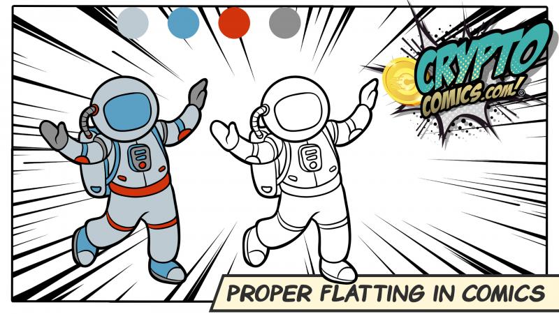
Welcome, my CryptoComic Compatriots! When creating a comic page or digital art, one of the first steps in coloring is flatting. Join us today as we give you a convenient and easy-to-use rundown on how to achieve this step.
In the line art, we separate large chunks into solid colors. It is a rather time-consuming process. Since it is almost a color by numbers process, most colorists will subcontract the work out to interns. This explains why I have had to do it for other artists in the past, sans-credits.
Well, today I am going to give you the most basic and quickest way that I know how to do this using ProCreate or Photoshop.
A paid Flatter can make anywhere from $10-$15 per hour. This will require about 2 pages per hour when you do it well. A good colorist will then take about 3 hours per page after you are done. Keep in mind that not every colorist has a Flatter.
Most Flatters are not necessarily hired by the comic publisher, but by the Colorist. Typically work is also paid upon completion of flattening, not upon publication of the work.
Most professional colorists that I know use a dedicated Flatter as an assistant or intern. Unfortunately, keeping that particular job is hard. It can be rather difficult to produce at the speeds necessary to keep up with the artwork coming in from the inker.
This is why having a dedicated workspace is essential to the success of the project.
Having an easy-to-use workspace with everything in its proper place will save you time and energy. This could also mean the difference between getting hired again for the next project.
I have a specific workspace just for flatting a comic that I’ve named “flat”. Here is how I’ve set it up. You can see the image below for the final results.
Up in the top navigation ribbon, click “Window”, “Workspace”, “New Workspace”. Name it Flat. I like to move the toolbar to the right-hand side as well.
Now to add the swatches. “Window”, “Swatches”. This will populate it in the top right dock. I like to drag that over to the left so that I can see all my color swatches at all times.
In the top right dock, I like to have “Colors”, Navigator” & “History”. You can go to the Windows in the top ribbon and turn them all on, group them together in the dock, and do not forget to save your workstation.

ProCreate isn’t as customizable as Photoshop but it is still just as intuitive. Make sure that you have the correct pens selected and swatches created by the colorist.
Each character should have their own swatches. What are the most basic colors that you will use? In the case of Superman, what is the actual color of the blue, the red, the yellow, the skin tone, the hair?

Is this for print or digital? You have to know this because in print, you will use CMYK, and in digital; RGB. Having the proper mode will be the difference between the first pass “go”, or starting over to convert it from one to another.
To make it easier, if there is currently an image of the character, use the eyedropper tool to select the colors out of the image. Make sure you are grabbing a color that is not in either a highlighted area or a shadow so that you can get the proper basic color.
We want the foreground to garner the most attention. These colors should be more vibrant. The background should therefore be more muted.
Whenever possible, I like to use cool colors in the background and warm in the foreground. This, of course, will not always make sense for the comic or the image. It works great in Superman, but not as much in Batman.
In these circumstances, I will turn to muted colors. This means that they are “grayed out” or desaturated for the background. When I am coloring this, I will add less color variation and gradients, but that is for our next tutorial on coloring a comic.
By using more saturation in the foreground, the colors will help your eyes focus on the main characters and the main action in the panels.
There are several different methods to choose from as far as progressing beyond the typical color-by-numbers process. I recommend talking to your colorist in order to find out how they would like you to proceed.
Grouping all of the colors can be quite tricky. I have seen all of the flat colors on a single layer titled “flats”. There are some advantages to this as it is quick and with 1 click you can see if you’ve missed anything.
There are some disadvantages such as the fact that there is no separation whatsoever between different colors or panels. The selection tool becomes a necessity in order to differentiate between anything.
I have created a group for each panel and began to work from there. This means that I will end up with about 6 different groups per page. The nice part of doing this, I can lock all the other panels so that I can only work on 1 panel at a time.
This is my preferred “go-to” method. I create a new single layer for every major color. It doesn’t matter what panel it is.
Let’s take a look at this finished piece below. This is a page that I found penciled online from Ivan Reiz. It is from Superman issue 3. where he meets Haywire. I decided to try a new way of coloring the page where I would add far fewer inks and shade using color.

As you can see I added all the blue from Superman onto a single layer. The red is on another layer and the skin tone is on a fourth layer. I separated these out completely. The shading is already done on these but you can see how each color is on its own.

I would never leave you hanging. Of course, I’m gonna give you a few tips that I’ve picked up along the way. Without further ado…
The edges are the key to everything. I overlap the inks and butt the colors up as much as I possibly can. This will eliminate white pixels that will show up in the finished piece. You may not notice them as much on a screen but they will shine like the Bat Symbol on a page. Make sure every pixel on the page is colored correctly without missing any!!!
Stick to the pallet that the Colorist gives you as close as you can. Keep in mind that there will be some stuff that the Colorist will change. They may not like the shirt color that a character is wearing so it may change.
Don’t take offense to it. This is good advice for anyone in the art field that is working commercially, “Don’t get married to your work. Allow it to change.”
Take the inked layer and move it to the top layer so that all the colors are behind the inks. This will give you a more comic book finished feel to your inks. Save your work and then ship it off to the colorist.
When I am sending this to a Colorist, I will save everything as a PSD. This will allow all of the layers to remain separate. DO NOT (I repeat do not) save it as a JPG. This will combine all the layers into 1. Let the colorist worry about merging all the layers if they like. Not your problem!!!
Both ProCreate and Photoshop can save as a PSD file. Emailing can be difficult due to the sheer size of the file. Google Chrome will often reduce the file size which can lose clarity and resolution. It is for this reason that I recommend Dropbox or any other file sharing service where high resolution matters.
Of course we aren’t near done with these tutorials. There will always be more to come. As long as creating comics is an ever-evolving process, we will continue to teach you how to create them.
Next up, I will begin showing you how to color a comic with a focus on the light source and how that affects the color and terminator lines. Until then, be sure to check out all the newest comics that are in the marketplace! While you're at it, submit your own comic. That would be awesome to read!

