
by Matthew Russell - Posted 4 years ago
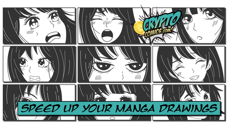
Welcome, my CryptoComics Compatriots. We are back with another article. This week's topic is all about Manga. We have written extensively before on the differences between Manga and American comics and how to draw the Manga face.
Today I decided to switch things up a little further and talk about the speed of Manga and how you can increase the speed and efficiency of your drawings.
With faster speeds, this leads to meeting deadlines. Let's talk about how we can increase the speed of our drawings. All tips listed below are common tricks used in Manga in order to improve efficiency.
There are times when you can forgo the background in exchange for some effect. Many times in slower more thought-provoking scenes, a solid color will suffice without hurting the image. Other times, speed lines!
SPEED LINES
A set of speed lines are simply lines that replace the background in order to give the illusion of movement. Another name for speed lines is speed stripes. For simplicity here, we will use the phrase speed lines.

Typically speed lines are slightly angled in order to give an idea of the direction of the movement. Completely horizontal speed lines should be used sparingly and indicate the direction that your eyes should be going.
GLOOM AND RISING LINES
A slight variation of the speed lines is the “gloom lines”. These are exactly what they sound like; lines that point downward and symbolize gloom.


Gloom lines (like thought bubbles) are slowly being phased out in recent manga comics.
Rising lines are the exact opposite of gloom lines, and are still rather prevalent in comics today. These lines start at the bottom and work their way upward in order to indicate excitement or an upbeat situation.

FOCUS LINES
Focus lines are done to accentuate a specific point on a page. This is typically done when trying to illustrate a point that even the characters will notice something at the same time as a reader. This can be based off of a character speaking, or a punch being thrown.

The other type of focus line is called the flash. Another name for this effect is the “Beam of Enlightenment”. This is where you have a sunburst effect using the more condensed focus lines that transitions to a black outer edge. It is represented by a flash of light and indicates a bombshell of some kind. Think of this as a sudden reveal. USE SPARINGLY!!!
One thing to remember about both speed lines and focus lines is that you need to vary the line weight and the grouping of the lines in order to avoid the pinstripe look. This, however, does not apply to gloom lines. Those are more uniform in width and spacing but vary in length.
SOLID EFFECTS
This is a simple sans background. In place of a background, you have a solid color. This keeps the focus on the image itself. It will also save you countless hours of having to draw an intricate background.

This is not to e done with every panel on every page. You must have an establishing shot, to begin with, to let you know various things such as the time of day, the setting, and the mood.
A screentone gradient can also be used as a substitute for the background.
WORD OF WARNING
Although the above effects are a great substitute for a background, I would only recommend using these suggestions sparingly. This will save time but remember to not shirk on your backgrounds or you will lose the faith in the reader.
t is recommended to only use 1 or 2 of these effects per page. Make sure that they are spread out throughout the page to avoid looking like you are simply avoiding drawing a background.
THE BLURRED BACKGROUND
Instead of simply drawing a new background and add a gaussian blur to it.

By simply blurring your background, you can save time on drawing it because you don’t actually need to go into great detail. Just make sure that your background is on a separate layer than your focus layer.
REUSE YOUR BACKGROUNDS
There are many times especially in Anima and American cartoons when a single background will get used over and over again. In fact, in many mainstream comics, this trick is used. Do you really think an artist wants to draw Gotham City over and over again?
Use what you already have available. Reuse it as often as you can to save time. As long as there isn’t something specific in the background that no longer applies to a scene; use it.
Manga is known to be a little rougher and less defined than typical American Comic. As a result, we can skip a step and not many will ever notice.

When drawing any comic, we will start out with the rough sketch (or the storyboard). This is where we will simply get the gist of everything on paper to see if we like the layout. Typically we will use simple shapes as defined in the blog post on the Fundamentals of Comic Book Art Part 2: Construction.
After we get our basic shapes we move into our “less rough” drawing stage. This is where we start adding in more details.
From there we typically take another pass at this and refine our drawing more. Instead, we will move straight to our inking stage in order to skip a lot of the intricate details.
This will give your manga a more “raw” feel to it. It will not look as refined and finished as a typical DC Comic. DC is known as the Cadillac of comics because of how smooth it is. Manga is not meant to be so smooth.
Cel shading is a form of adding shadow and depth to your drawings. It got its name from the celluloid cartoon drawings of the past.

Start with your base color and add your shadows as a block color with no shading to them. Follow that up by doing the same with highlights. The advantages are that it is a low difficulty level and that it’s time-effective.
I might have to come up with another post at a later date as a tutorial of exactly how this is done. Let me know in the comments below if that would appeal to you.

Check back with us next week as we ask the simple question “Will the Indie market really upset big publishing?” I have a lot to say on the matter. Until then, I hope that you will accept this small token of appreciation from us for getting this far in the article. Try out the badge code “Cel” and see what awaits.
Until next time, take care, my friends.

