
by Matthew Russell - Posted 2 years ago
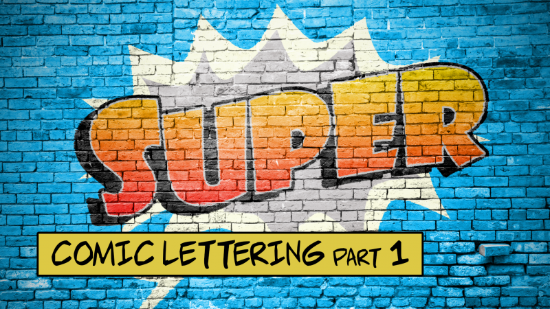
Welcome my CryptoComics Compatriots to the definitive Comic Lettering Tutorial. This will be the last Comic Lettering Tutorial that you will ever need. There is so much that I am going to go over here so buckle up.
In the past I’ve written several blog post on the subject. Each one barely broached the subject, so I’m diving in today and am going to really break down everything. I’m dusting off my teaching cap in order to give you the definitive guide to lettering a comic.
For this exercise I will lettering RoundHouse Hooligans issue #3 from Freefall Comics. In all transparency, I worked on this on a per page basis. Where I did get paid to letter this book, I am getting no financial compensation for any of you purchasing the book. That being said, this is such a fun book, you NEED to go check it out! I was given permission from the crew over there in order to use this in a tutorial for all of you.
Let's begin with a History Lesson.
Ah, the often overlooked world of comic lettering—where the unsung heroes of the comic book realm reside. Sure, dazzling illustrations get all the glory, but let's give a slow clap for those tiny, squiggly lines of text that actually tell you what's going on. Welcome to 'Mastering the Art of Comic Lettering: Essential Rules to Follow,' where we'll explore how those little letters can make or break your caped crusader's dramatic monologue.

In the early 20th century, when comics were budding in newspaper strips, lettering was a straightforward affair, mostly done by the artists themselves. It was functional, with little emphasis on style or flair, serving the primary purpose of telling the story.
As comics evolved and found their way into book formats, the 1930s and 1940s saw a shift. Lettering became an art in its own right. The Golden Age of Comics birthed the first breed of professional letterers, individuals dedicated to the craft of shaping dialogue and sound effects. This era solidified the uppercase style for dialogue, a standard that persists largely due to its clear readability.
The Silver Age in the 1950s and 60s brought technological advancements. The introduction of the Ames Guide in the 1960s, a tool for creating uniform lettering, marked a significant leap, allowing for more consistency and precision. This period also saw the rise of distinct lettering styles, with letterers like Artie Simek and Sam Rosen becoming stars in their own right, their styles as recognizable as the artists they accompanied.
In the 1970s and 80s, the comic book industry saw explosive growth, leading to a higher demand for letterers. This was the era of experimentation, where lettering started to play with visual storytelling elements, manipulating font sizes, shapes, and balloon styles to convey emotion and action dynamically.
The late 80s and 90s heralded the digital age. Digital lettering began to replace hand-lettering, leading to a revolution in the craft. Tools like Adobe Illustrator allowed for unprecedented precision and creativity, although some argued that it stripped away the 'soul' of hand-crafted lettering.
Today, comic lettering is a blend of old and new. Digital lettering dominates, offering efficiency and versatility, but there's a renewed appreciation for the organic feel of hand-lettering, seen in independent comics and webcomics. The evolution of comic lettering reflects the broader story of comics themselves: a continuous dance between artistic expression and technological advancement, where each letter on the page holds the weight of history and the promise of innovation.
I will be expanding this to an entire blog post someday where I will give you a walkthrough of exactly how comics were lettered in the past, just so you can see how technology has advanced.

Speech Balloons: These are the bread and butter of comic lettering. They contain the dialogue of the characters and are typically oval or cloud-shaped. The placement and shape of these balloons can influence the reading flow and the tone of the conversation.
Thought Balloons: Different from speech balloons, these are usually cloud-like or bubbly and contain a character’s thoughts. They are a window into a character's inner world, providing depth and insight without spoken words. These are typically not used anymore, but it is good practice in order to learn the shape tool.
Narration Boxes: These rectangular or square boxes provide context, background information, or the inner monologue of a character. They're often used to set the scene or move the story forward.
Sound Effects (SFX): Bold, vibrant, and often onomatopoeic, sound effects visually represent the sounds within the comic, from a subtle 'whisper' to an earth-shattering 'BOOM'. They are integral in bringing action scenes to life.
Captions: Similar to narration boxes, but they can also provide additional information like location, time, or specific details about a scene or character. They're the voice of the unseen narrator, adding layers to the storytelling.
Emphasis Text: This involves bolding, italicizing, or coloring certain words or phrases to add emphasis or emotion. It's a subtle art; overuse can dilute the impact, but when done right, it can significantly enhance the narrative.
In the digital age, a variety of software and tools have emerged to assist in comic lettering, each offering unique features and capabilities. I would always recommend using a vector graphics program over a raster graphics program to Letter a comic. That is why Photoshop is not on this list. Here’s an overview of some popular choices:
Adobe Illustrator: A staple in the graphic design industry, Illustrator is renowned for its precision and versatility in creating vector graphics, making it ideal for lettering. Its robust typography tools allow for detailed control over letter shapes, sizes, and spacing. This is hands down the easiest. There are so many different tutorials that you can easily find online.
Clip Studio Paint: Favored by many comic artists for its drawing capabilities, Clip Studio Paint also offers excellent lettering tools. Its balloon and text tools are specifically designed for comics, simplifying the process of adding dialogue and narration.
CorelDRAW: A powerful vector graphic design software, CorelDRAW offers comprehensive typography tools, making it a solid choice for lettering. It’s particularly useful for creating custom font styles and effects.
FontLab: For those interested in creating their own fonts, FontLab is a professional font editor that provides extensive tools for designing and editing typefaces.
Procreate (iPad): While primarily a drawing app, Procreate includes a good set of text tools for lettering. It’s a great option for artists who prefer to work on a tablet. I use Procreate for so much but honestly I’m not a fan of trying to letter here. It is raster, plus it is far too easy to accidentally change the shape and size by accidentally tapping the screen. I can write a tutorial for this, if enough people ask for it, but I will instead link a good tutorial under here.
Affinity Designer: A cost-effective alternative to Adobe Illustrator, Affinity Designer offers powerful vector tools and is gaining popularity among comic creators for both art and lettering.This is a lot cheaper than Illustrator. I have discussed the differences so many times in the past. It is an absolutely fantastic program, one that I recommend to ANYONE that doesn’t want to spend the extra cash on Adobe.

Getting started with digital lettering can seem daunting, but with the right approach, it can become a seamless part of your comic creation process. Here are some steps to get you started:
Choose Your Software: Select a software based on your specific needs and budget. Consider trying out a few with free trials to see which one you’re most comfortable with.
Familiarize Yourself with the Tools: Spend time exploring the typography tools in your chosen software. Understand how to create and manipulate text, how to use different fonts, and how to adjust sizes, spacing, and alignment.
Practice with Basic Projects: Start with simple lettering tasks, like creating speech balloons and basic narration boxes. Gradually experiment with different balloon shapes, text styles, and effects.
Learn About Layers: Utilize layers to separate your lettering from the artwork. This helps in making adjustments without affecting the underlying image.
Experiment with Fonts: While there are many fonts available, find a few that suit your comic’s style. Remember to check the licensing of the fonts for commercial use.
Watch Tutorials and Take Courses: There are numerous online resources, tutorials, and courses available that can help you master digital lettering.
Practice, Practice, Practice: Like any other skill, getting better at digital lettering takes practice. The more you work with the software and tools, the more efficient and creative you will become in your lettering.
Digital lettering opens up a world of possibilities for creative expression in comics. With the right tools and a bit of practice, you can add professional-quality lettering to your comic projects, enhancing both the visual appeal and the storytelling impact.
The font you choose for your comic can be as impactful as the artwork itself. It's not just about aesthetics; it's about readability, mood, and matching the style of your narrative. A good starting point is to stick with classic comic fonts - they are legible, versatile, and have stood the test of time. When selecting a font, consider the genre and tone of your story.
A whimsical font might be perfect for a lighthearted children's comic, but a more serious, noir-style story demands something cleaner and more direct. Additionally, consider licensing rights - ensure the font you choose is free for commercial use or properly licensed.
Fonts can be a tricky and legal thing. Make sure that your usage rights for a particular font are in good standing. I’ve seen an independent artist have to pay more than what he made selling his single comic to a font creator because he used a font illegally.

Many font websites such as BlamBot will give strict guidelines on their fonts. You might either need to pay for it, or give credit to the font creator. Some are free to use with no credits needed. Just make sure that you are following along with sad guidelines, so you don’t end up in court. If you have any questions regarding this, please seek legal help from a lawyer. They will point you in the right direction.
I am not a lawyer, I know enough about the law to tell you to go seek a professional.
Do:
Keep it Legible: A font size that is too small can strain the eyes, while too large can overwhelm the art. Find a balance.
Maintain Consistency: Use the same font size for regular dialogue throughout the comic. Changes in size should be intentional for effect.
Respect the Space: Ensure your font fits comfortably within your speech balloons or boxes without touching the edges.
Don't:
Overdo Styling: Avoid excessive italics, bolding, or underlining. Use these styles sparingly to maintain impact.
Mix Too Many Fonts: While different fonts can differentiate between characters or elements, too much variety can look chaotic. I recommend NEVER MORE THAN 2 (not counting sound effects). I typically use 1 font for spoken words, and 1 for shouted words.
Ignore the Art: The font style and size should complement, not compete with, the artwork. Do your best to NEVER place a word balloon over in important piece of artwork, but more on that later.
Typography in comics isn't just about the words; it's about how those words are presented. It sets the rhythm of reading and can convey mood and atmosphere. For instance, a jagged, rough font can convey tension or anger, while a flowing, script-like font might be used for romance or elegance.
The right typography can enhance the emotional impact of a scene, while the wrong choice can detract from it. Readability is also key - a comic should be as enjoyable to read as it is to look at. Balancing style with readability ensures that your audience stays engaged with your story from start to finish.
In essence, fonts and typography in comics are not just tools for displaying text, but powerful elements of storytelling that, when used skillfully, can significantly enhance the reader's experience.

As we wrap up our exploration of the foundational aspects of comic lettering in Part 1, we've delved into the crucial roles of understanding the basics and mastering the nuances of fonts and typography. This section has not only illuminated the importance of lettering in the storytelling process but also provided practical insights into choosing the right fonts and maintaining consistency.
It’s clear that lettering is more than just a means of inserting dialogue into your comics; it's an art form that enhances the reader's experience, guiding them through the narrative journey with clarity and impact.


