
by Matthew Russell - Posted 5 years ago
Welcome, my CryptoComic Compatriots! This is the final post in the 9 part series all about the Fundamentals in Comic Book Art. This has been an exciting series that I have loved writing.
Today we are going to break down the last but definitely not the least of the fundamentals; the material and tools. Before we get into all of that, let’s recap a little bit.
Fundamentals of Comic Book Art Part 1, gave a brief but exploratory intro into what the fundamentals are all about.
Fundamentals of Comic Book Art Part 2 went into how to break everything down into simple shapes. This will help in the spacial aspect of your drawing as well as start to bring out the third dimension.
Fundamentals of Comic Book Art Part 3 got into viewpoints quite a bit as we went from a flat image all the way to 3 point perspective.
Fundamentals of Comic Book Art Part 4 was one of my favorites as we took a look into the relationship of the basic human anatomy.
Fundamentals of Comic Book Art Part 5 explains how color and light relate. Shading and coloring took the forefront as we dove deeper into the subject.
Fundamentals of Comic Book Art Part 6 began our journey into composition of a piece. Just like a musician, everything needs structure and composition.
Fundamentals of Comic Book Art Part 7 jumped back into our anatomy lessons as we learned how to create gesture drawings.
Fundamentals of Comic Book Art Part 8 took us into the principles of designs. Basically, how to put everything together in a way that makes sense.
Normally, when we are discussing the fundamentals of art in general, we stop at the Principals. No one goes any further. After several lengthy discussions with some O.G. artist, I decided to include this last one; materials.

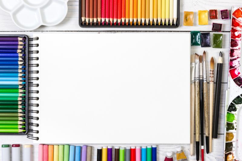
Every craftsman has their tools; a carpenter has their hammer, a mechanic has their wrench, a wizard has their wand. Every artist needs to be completely comfortable with the tools at their disposal, and that's what we are going to be discussing today.
It all starts with a simple question, what brings you joy? Do you want to airbrush, become a graffiti artist (like my boy Miles), what about a penciller, inker, colorist, letterer, painter… The list goes on and on.

We are going to focus mainly on the tools of the trade for comic artist, but please understand that this goes far beyond comics, sculpture for instance.
The paper and pencil. It always comes back down to this. No matter what artistic field of study (art discipline), it always comes back down to a simple pencil and paper.
This has got to be the most important tool in your tool belt. Think of it as the simple batarang of art. This is what most people begin with.
Today's technology allows the combination of multiple steps to be smashed into the penciling stage; while using Procreate, you can digitally color and forgo the inking stage all together during the initial drawing stage.
This doesn’t mean that this is less important; the opposite, in fact. Get relaxed, take a deep breath and let the lead flow through you. Let's start with paper and a pencil (assuming you're not using a digital workflow).
I love the Comic Bristol board from Canson. It has the best feel. Strathmore has a cheaper version, but it just doesn't have the same feel. It's personally too smooth. As far as pencils go, there is only one; Offidea set. I love this mechanical pencil. Don't forget to pick up some blue lead (ok, graphite. I know they don't actually use lead anymore.)
Start with your sketches and remember to always have a good eraser on hand. If you are using Procreate or any other digital artist tool, the double finger tap to undo will save your life.
Learn to control your breathing. Just like firing a gun, major strokes must be controlled by exhaling. This will help steady your hand and you will get a much smoother line.
When holding the pencil, most people will use the “tripod” grip. This is grip is typically used for writing. Drawing is not the same as writing so why do we do this? Well, elementary teachers are to blame. They “taught” us how to correctly hold the pencil because the need to teach us to write.
There is a better way, but it takes a ton of practice. Watch the video below. I know, this guy is annoying, but the information is there. You will get a ton out of it.
I am only learning the history of inking for this blog post and it is actually fascinating. Long before comics, pencil artist started inking their work in order to add depth and dimension to their work. It also had another practical purpose, printing presses could not reproduce penciled work, so it was cleaned up and darkened.
While I’m inking, I prefer to stick as closely to the original artist work as possible, but that is not all. I must interpret the work that is given to me. I am also the final stage where I can correct a piece of work.
Basically ask yourself, what is the artist envisioning and what makes sense. With a pencil, you can get a lot of shading. As an inker, how do you portray that?
Digital inking personally feels less natural, but is still easier. I’ve followed the “How To Draw Comics channel recently and they have a great video for digital inking. They don’t talk much about how to use the program and just talk about inking itself. Check out the video for yourself.
Now, since this is a tutorial all about learning your tools and knowing the material, here is a quick video all about how to use Procreate app.
I personally have created an artboard at 11x17 and 300 dpi that I use for my standard drawings. If I am going to print it out, I will switch to CMYK but since 90% of my work is digital, I keep it in RGB. More about that on the Size, dimensions, colors, and styles. What does it all mean? Part 1
There are so many different styles in inking: brushes, pens, even markers, that it is difficult to give advice other than to simply practice. Find your own style and then reform that style. Get great at a certain technique that you can manage to hit your deadlines with.
This doesn’t mean that when you find your way, you shouldn’t experiment with it. Some might find more joy in cleaner multiple smaller lines, but in order to pay the bills, they use a different technique altogether. Check out the following video for some great ways to get started.
Personally I use a combination of the first dragon and the second. I will go over everything with a smaller pen and then follow it up with a darker thicker one in order to vary my line weight. After that, I might go in and hit some of the shadows in order to give it more depth. However you do it is fine, as long as you're happy with the results.
I do all my coloring digitally. This is for 1 simple reason, layers. While in art class, I always made some excuse why my pieces were always in black and white or monochromatic. Basically, it came down to the fact that I wasn’t good enough.
I found that while I am now coloring on the iPad, I can add flats to 1 layer, shadow to another, and so on. Now, lets get into the terminology of coloring.
Flats: This is the most basic color of an object. We put this down first. If someone is wearing a red shirt, then we block in the shirt red without anything else.
Cast Shadow: This is the hard lined shadow cast by something blocking the light. When you are walking down the street on mid-day, look at the shadow that you are casting onto the street.
Form Shadow: This is a softer more gradual shadow cast by the change in direction. Look at a ball. You can see that the light hits it differently based on the curve.
Highlights: This is where the light directly hits the object. This is your shine, your sparkle. This is light being directly reflected at you.
Reflected Light: Unlike the main highlight, this is where light bounces off something and hits the object. Most artist and colorist forget about this stage, but this is where the true genius lies.
Artist Jemma Young came on to our “How To” show to teach everyone the art of coloring a comic. Her work is so remarkable. Don’t get discouraged when you watch this, it takes years of practice to instinctively know where all the highlights and shadows go.
This is one of those artforms that is often overlooked. If you have the wrong lettering style in a comic, it will throw off the aesthetic of a book, and you won’t even realize why.
You have to start with the question, is this hand-lettered or digitally added? What font and font size do I use? What about the kerning? Where do I put the lettering? What sound effects will be created by the penciler?
Overwhelmed yet? I was too. I got to the point where I would throw my hands up and simply bring my comic into the Comic Draw App and just do it automatically there.
This is honestly not a skill that I have mastered by any stretch of the imagination, so I will refer to my friend Gerimi Burleigh. He makes it look so easy.
Another master of their craft is the great Todd McFarlane. His contributions to the comic world are undeniable. While working on Spawn issue #284, he took some time to show people how he adds the lettering to his initial drawings. Yes, he thinks about this during the penciling stage. Check out the video below to see how he does it.
Just because we are now done with the fundamentals of comic book art series, doesn't mean that we are close to done with giving you countless tutorials on how to make a comic. Hell, we have an entire show dedicated to that process.
Keep an eye out on your dashboard and we will bringing you some more great content that you can use when you upload your own books. Until then, stay safe and happy, do what it is you love; create.

